What did the data bring to us?

In the lecture day of the class, instructors lead us to explore the easy data analysis tool-Voyant. Voyant is a web-based tool that can gives people an insight to see the structure of the article or magazine and the topic. During the exploration of the Voyant, I found this tool can variable way that allow people to dig into the article without spending too much time on the reading. And I come up a few questions to the data analysis tool not only to the Voyant but also to other tools.

  • Why we choose Voyant?
  • what are the advantages and disadvantages of the Voyant?
  • What contribution the data analysis tool can provide to the DH filed?

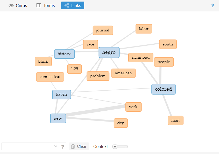
The obvious reason for question 1 is accessibility. The way that people can get data is very simple, you just need to find the TEI data about the article you want to research and upload to the Voyant, and Voyant will help you to analyze and feedback visualized data to you. In the meantime, Voyant can provide various ways to shows the visualized data, from normal cirrus even to the DreamScape. So if someone wants to figure out what’s the article talking about without spending too much time reading. This easy to use tool is suitable for these people.

DreamScape from Vol. 1, No. 6

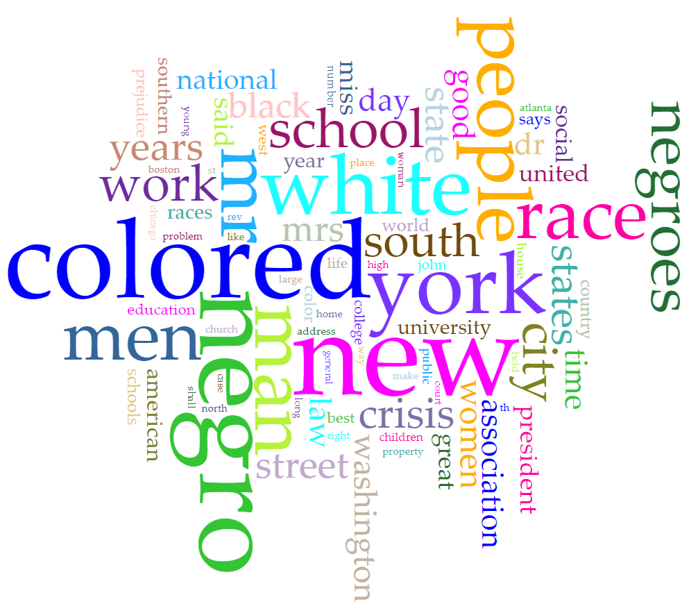
The advantages are clear, easy to use, easy to export your result, different ways to see the graph, and save time. But the disadvantages are also obvious, even this tool can save some time, but without looking the whole magazine, it is hard to understand the main point of the article. For example, the image below is the visualized data from Vol. 1, No. 6.

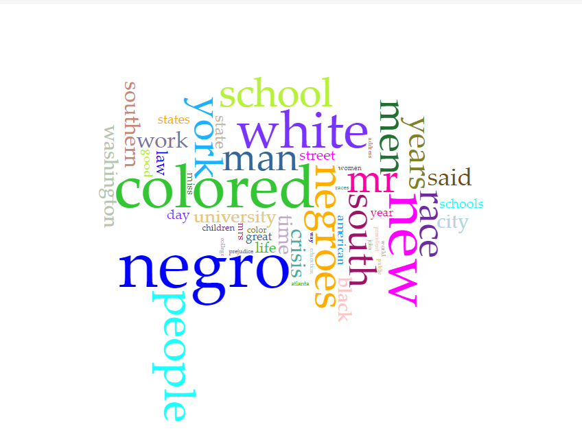
We may get some idea that what this magazine talking about. But we cannot get the main point of the magazine without reading the whole magazine.

I think the main contribution to the DH is tricky. Data analysis and visualization tools can provide a new way to understand the article and magazine.

Blog Post – Jae (leejae44)

Main Topic: Text Data Analysis Visualization Practices for The Crisis Magazine with Voyant

Focus Aspect: Collect text data from The Crisis and visualize them with tools in a form of a chart or graph.


Main Idea:

  • The impact of virtual space technology created by a person named digital humanities played a role in improving the technology of data collection and summary visualization, which laid the foundation for the activity of data visualization belonging to Journalism and other text related studies. So what I’d like to know is how transformation with Voyant is done to simplify the data collected from words to follow up the trends and mobilize it.

Research Questions:

  • What data transformations are applied in order to investigate text data with data visualization?

Visualization of the process:

  1. After research on written words, develop various raw data.
  2. Clean up the data in tables.
  3. Choose visual structure types.
  4. Prepare data which transformed while collecting and analyzing.
  5. Create a visual chart or graph.

Analyzing results: 

The analysis is performed using systematic methods to find trends, grouping, or other relationships between different data types. Data Visualization is the process of putting data into charts, graphs, or other visual formats to inform analysis and interpretation. In conclusion, the letters from The Crisis magazine are organized into classifications such as data visualizations, and the themes are distributed as a trend to suit the times, and the work continues to our generation. If these technologies are further studied and developed, I am sure that the information and communication technologies and technologies related to emergency relief signal communication will also be developed to help enrich people’s lives.


Thematic Visualizations of The Crisis

After reviewing issues of The Crisis through the Modernist Journals Project, I grew interested in how the subject matter was selected for each respective issue. One main question that came to mind was whether the content included was meant to support or signify a central theme. I thought this question was relevant given the format of The Crisis being like that of a magazine, as many magazines’ plan their issues based on specific topics. That said, I also considered whether this was truly applicable since there are many differences between The Crisis and current magazines. These differences range from the social and political context (given the subject matter they may include), to more logistical constraints such as financial resources, staffing, and time. 

Keeping all this in mind while exploring Voyant’s visualization tools, I was hopeful that one would be effective in identifying an issue’s theme. Of the different tools Voyant provides, I found Links to be the best option in this case as it has multiple features that provide contextual information about the most frequent words or terms present in a document. Using this tool, I decided to assess the following research question:

How does Voyant’s Links tool help visualize the theme of an issue of The Crisis? 

I chose Links to visualize the theme of the Vol. 13 No. 3 of The Crisis because it provides an image of the most frequent words that appear in the issue along with the words they are most commonly associated or “linked” with. This tool provides context and insight about the issue by focusing on the most common terms and phrases that appear. If The Crisis selected content based on a single theme, then the Links tool should represent the most common words and therefore illustrate the theme.

Screenshot of Voyant Links tool analyzing The Crisis Vol 13. No2.

The image above depicts the Links illustration of the analyzed issue from The Crisis. Although the tool informed me of the most common words, it was difficult to discern any particular theme as I had hoped I would be able to. While this tool can be used to support engagement in the text, and the feature of “fetching collocates” for the words that first appear does provide additional context, the level of clarity or insight about the issue’s theme is not given. However, this visualization could be used in a multi-step process that would help in determining the theme as it does list the frequency of terms and their relation to others which is still helpful information. 

Ultimately, platforms like Voyant are critical in providing alternative illustrations and ways for audiences to engage in readings and for analysts to dissect and examine content. While my research question is inconclusive at best, I still support that the Links tool was the best choice for visualizing in this case. Seeing the connections between the most used key words and those keywords themselves could point to the theme of the issue, even if it is not entirely clear. In the future, a better strategy that could be used to analyze this content would be to only analyze similar content types from within an issue. Meaning, selecting only the literary pieces, like editorials or poetry, rather than also including advertisements and cartoons, may improve the utility of the Links tool. Removing this extraneous content which may not support the theme of the issue would change the visualization in such a way that the theme may become more apparent and provide insight to Voyant users.