How would you become a popular author at The Crisis?

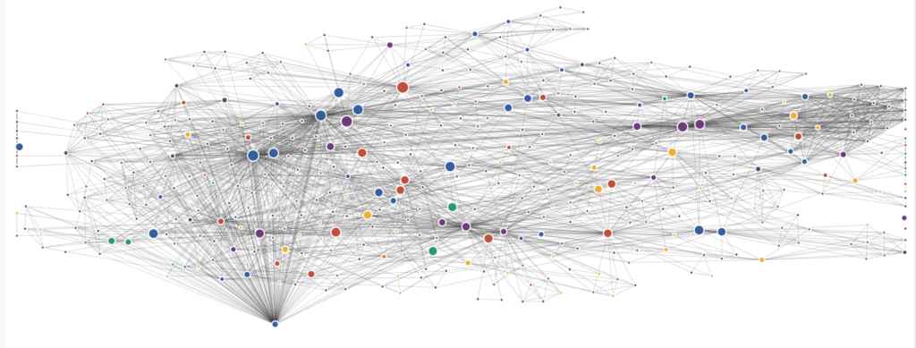
So, it’s 1910 and you want to be a writer at “The Crisis?” How can you become as popular and interconnected as the famous W.E.B Du Bois? Is it your genre? Perhaps more so the time you spend writing for “The Crisis?”

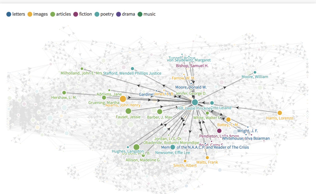
Well, for one Du Bois was one of the founders of The Crisis so right off the bat he has an advantage. Now as one can clearly see, by highlighting over W.E.B Du Bois, he is connected to nearly every author, so much that the lines and the thickness don’t show up. Only the biggest circles can be seen. I intentionally wanted to show how intense all the interconnectedness can be. This cluster was shown when clicking on Du Bois’ tab, which was blue (articles). So is that it? Should someone just write articles to become the most popular? Du Bois was indeed writing a lot of articles, but also for a long time too.

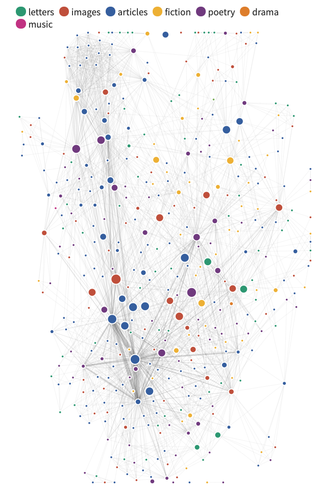
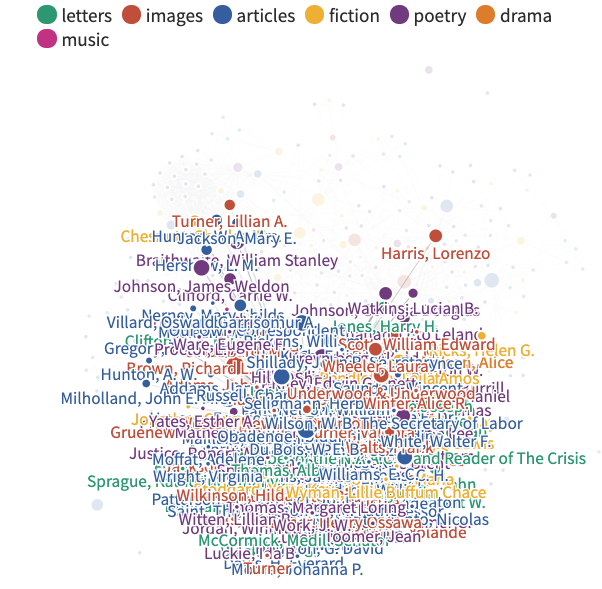
At a first glance, it appears as though writing articles and poetry automatically get you high interconnectivity. But is this always the case? As it turns out, no. You also have to be connected with other authors in their publications too. Basically like contributing to their work.

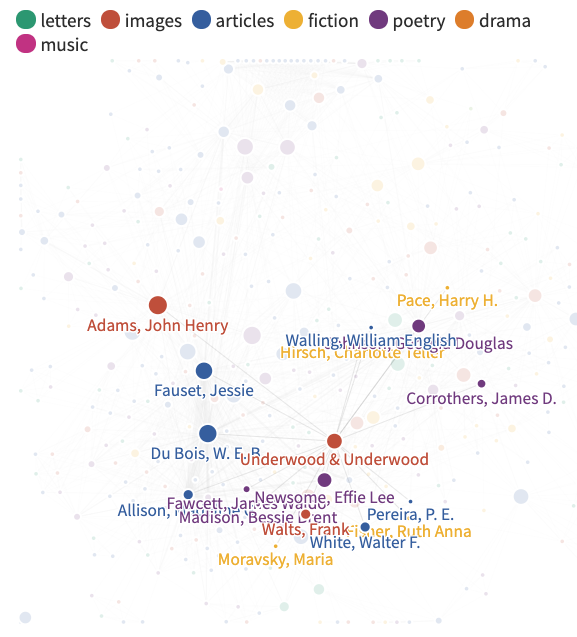
Take a look at Underwood & Underwood (in orange) for example, they have one of the biggest circles but are not connected as much compared to Du Bois. Now why is this? Well this author did not write for the crisis as long and wrote less than Du Bois. Not to mention they were not as connected with the other authors.

When looking at Madeline G. Allison for instance, she is very interconnected but she has a smaller circle than Underwood & Underwood. To be clear hers is the blue circle dragged down in the left corner. Why is this? Well in this instance, she will likely have been with The Crisis for longer than Underwood & Underwood and has more connections to other authors. In short, the longer you are writing and the more connected you are to authors at The Crisis, the bigger your circle and the more connections you will have. On the question of what you should write about, i.e. articles, fiction or poetry seem to be some of the most popular. So stick with those.

The Crisis Authors 1910-1922

This tool was an interesting way to look at The Crisis Authors 1910-1922 dataset. It allows for different questions to be asked and can find different information about he dataset by using this took. The Flourish tool created for seeing different information including the articles, images, people, letters and more. By moving around on the visualization you are able to see connections between people and all of the other connections between a specific object.

I spent a bit of time looking through this tool and found that it is very useful for looking at a dataset. After thinking about what the tool is used for I thought that an interesting research question would be:

What types of connections are formed from the Flourish Network tool that you can use to form conclusions about with other information from the dataset?

This was an interesting research question for me because as I was looking at the different connections formed through the tool I began wondering if I was able to make other connections between some of the other given information formed. I began looking into one of the specific poetry works to try to get more information about that one topic.

How can data visualization help in our daily reading

In this class, we examined how Voyant, an open-source, web-based application for interpretation of texts or corpus. This technique illustrates and analyze the text and transform word into visualize data. My focus would be how this analyzation and visualization help in daily readings and even on scholarly writings. In what extend can we learn from the data being analyzed in Voyant.

How does Voyant analyze The crisis magazines?

I chose Modernist Journals | Crisis. A Record of the Darker Races. Vol. 1, No. 6. I exported and analyze it on the Voyant so that it demonstrated the the word that is being used.

It demonstrated that most frequent words in the corpus: project (7); journals (6); modernist (4); object (4); archives (3).

It demonstrated what chapter is the word on and what page it showed on. The chart showed the frequency in the document segments.

Can we use Voyant as a resource in our daily life? What kind of resources?

The Voyant is powerful tool to analyze the text and the frequency of how words being used in the document. It may not be useful in daily used for reading magazine that we just need to get the information out of. However, I think it is interesting to see and know to analyze. For example, how the author mainly used the word to demonstrate or highlight what kind of point of view in the project. Or we can analyze for ourselves for published document that the frequency word we use and how is it affect in the document.

Overall, I think Voyant is a powerful tool but it is not very helpful in our daily reading.

Analyzing Education in “The Crisis” using Voyant Tools

Research Question: How often did The Crisis cover education?

This examination of The Crisis uses only one issue, volume fourteen, number three of The Crisis, to explain how Voyant Tools can contribute to an analysis of how often The Crisis covered education. Voyant Tools provides numerous visualizations that arrive to users through data extraction taken Text Encoding Initiative data. Using the TEI data provided by the particular issue of The Crisis allows users to upload the data to Voyant Tools’ web-based platform.

Text

Description automatically generated

Figure 1 – Word Bubble

A default visualization of Voyant Tools, the word bubble, gives the first glimpse into the prominence of specific terms within the particular issue of The Crisis. The bubble provides terms that jump out: college, students, schools, graduates, teachers, university, bachelor. The size of the terms within the bubble illustrates the frequency of the term within this issue. The word bubble shows that educational topics hold a significant role within this issue of the publication. 

A picture containing table

Description automatically generated

Figure 2 – List

A less visualizing appeal, but data-centered use of Voyant, the list of all terms within the issue, gives raw data on the frequency of different terms. The list of terms contains each term used within the issue and ranks them from most frequent to least frequent, and provides how many times Voyant found the term within the TEI data. The most frequently used ten words in this issue demonstrate how prevalent purely educational terms appear within the issue. 

Chart

Description automatically generated

Figure 3 – Trends

Trends serves as a concluding example of the numerous tools found within Voyant. Trends enables a user to explore where particular terms appear within an issue of The Crisis. Using the seven educational terms that appeared in the word bubble, Voyant provides evidence that this issue focused on education throughout the issue. However, the focus on education skewed much toward the first half of the issue. 

Voyant Tools provides users with helpful digital tools for analyzing literary data. Researchers interested in literary analysis should give attention and time to Voyant Tools to determine how it may aid their particular research projects.

Final Project Check in Meeting (11/16 – 12/3)

For the full description of the final project, see the Final Project page.

Sign up for a timeslot in Mattermost to meet with the instructors. We will discuss the progress you’ve made on your project, brainstorm ideas and strategies for troubleshooting, provide feedback, and assist with any challenges you are facing.

This assignment is not given a letter or numerical grade, but if you do not meet with the instructors, you will lose points on your final project grade.

Final Project Brainstorm (9/25)

For the full description of the final project, see the Final Project page.

Brainstorm ideas for the final project and start thinking about what research questions are behind your interest in these ideas. May include up to two ideas, with at least 4-5 sentences explaining the idea and the research interest behind it. You may change your mind as you progress through the semester, but keep in mind that the earlier you begin working on your project, the easier it will be.

This assignment is not given a letter or numerical grade, but if you do not turn it in you will lose points on your final project grade.

Final Project Grading Rubric

Brainstorm, check in meeting, and draft presentation (5%)

  • If you complete each of these assignments, you will receive full credit. If not, you will be docked points.

Proposal (10%)

  • Describes the research question to be explored
  • Narrates:
    • How you came to choose your topic
    • How the research question evolved over the course of the semester
    • Your goals for the project
  • Describes a project that:
    • is appropriately scoped
    • makes use of one or more digital humanities method(s)
    • is likely to produce findings that respond to the research question
    • produces a final deliverable in the form of a website or essay
  • Provides a source of data that will be analyzed
  • Cites at least three sources

Presentation (10%)

  • Communicates the research question and motivation behind the project 
  • Showcases the final project deliverable and shares findings
  • Explains the methodology and processes that led to the final product
  • Uses time appropriately (did not finish too early or over time)
  • Presentation is organized and flows naturally
  • Communication is clear, engaging, and polished (including, eye contact with audience members, did not speak too fast or too slow)
  • Uses slides that enhanced the presentation

Final Project

  • Methodology (35%)
    • Answers the prompts described in the methodology section above
  • Argumentation and Analysis
    • Project Evaluation Template (25%)
      • All sections of the template are addressed in the project deliverable
    • Findings/Conclusions (5%)
      • Research findings and conclusions are communicated in the final project deliverable
  • Self-Reflection (10%)
    • Thoughtfully considers the experience of the final project
    • If part of a group, considers and reports on how the group worked together, both successes and challenges
    • Meets the minimum length requirement of one page single spaced (12 point font)

Tool Presentation (10/9)

(8% of overall grade)

Introduction and goals

While students will have exposure to several DH tools and methods in class during the semester, there are many additional options for data collection, management, and visualization. In preparing for this presentation, students will gain experience in critically analyzing a DH tool by asking questions about its context, audience, and use cases. By sharing this tool with the class, students will share newly-gained expertise and learn from each other. After these presentations, students will also have a better sense of what options they will have for pursuing the final project.

Description

Each student will present a digital humanities tool to the class. The tool will come from the list below (or at the approval of the instructors).

In a 6 minute presentation, address the following questions:

  • Background and technology:
    • Who made this tool or platform? Who maintains it now? (this could be individual(s), companies, or a combination of the two) 
    • Where in the world is the tool based? 
    • What background can you find about the tool? 
    • How long has it been around? Is it updated regularly?
    • Is it open source? (definition of open source
    • Is it freely available? Does it operate on a freemium pay model? Was it funded by government or foundation grants?
    • Who is its primary audience? (K-12 students and teachers? Journalists? Data scientists? Humanists? Non-profits?)
  • Use cases:
    • What is the tool capable of doing? 
    • What is it most commonly used for?
  • What are its strengths?
  • What are its limitations?

While providing a live demo of the tool may be useful, plan to have backup slides with screenshots in case the technology/connectivity fails on the day of the presentation.

Students are encouraged but not required to use the provided slides template for their presentation. Slides are not graded on their own, but they are a key component to a successful presentation because they help keep presentations to time and provide structure. Students are strongly encouraged to include slides with screenshots of projects instead of clicking out to live project websites. This encouragement is for two reasons: 1) in case the live site crashes or connectivity goes down, the project can still be shown; and, 2) to help keep the presentation to time. For more tips on creating effective slides, see the Suggestions for Successful Slides document

Early exposure to a range of Digital Humanities tools will help students have a better understanding of how projects evolve and will assist in shaping final project choices.

Tool Options

All tools below are welcome topics for the Tool Presentation assignment. The groupings are meant to provide a bit of additional information for students to understand how the tools might relate to the final project.

Tools around which you can build a final project

  1. Tableau – https://public.tableau.com/ (visualization, mapping, etc)
  2. Twine – http://twinery.org/ (gaming)
  3. TAGS – https://tags.hawksey.info/  (twitter collection)
  4. GraphCommons – https://graphcommons.com/ (networks)
  5. Palladio – http://hdlab.stanford.edu/palladio/ (networks, mapping)
  6. Esri StoryMap – http://storymaps.arcgis.com/  (narrative mapping)
  7. Airtable – https://airtable.com/ (databases)
  8. Vistorian – http://vistorian.net/ (maps, networks)
  9. Onodo – https://onodo.org/ (networks)
  10. Flourish – https://flourish.studio/ (visualization)
  11. CollectionBuilder – https://collectionbuilder.github.io/ (archiving)
  12. TwoTone – https://twotone.io/ (data sonification)

Tools that can help with a final project but aren’t quite enough to be the final project

  1. StoryMap JS – https://storymap.knightlab.com/ (narrative mapping)
  2. Tiki-Toki – https://www.tiki-toki.com/ (timeline)
  3. Timeline JS – http://timeline.knightlab.com/  (timeline)
  4. Flourish – https://flourish.studio/ (visualization)
  5. DataBasic – https://www.databasic.io/en/ (text analysis and networks)
  6. MapWarper – http://mapwarper.net/ (georectifying maps)
  7. OpenRefine – http://openrefine.org/ (data cleaning)
  8. RAW Graphs – https://rawgraphs.io/ (visualization)
  9. Tabula – https://tabula.technology/ (transforming tables into data)
  10. Tropy – https://tropy.org/ (data organization)
  11. Color Oracle – http://colororacle.org/ (accessibility)
  12. Viz Palette – https://projects.susielu.com/viz-palette (color palette; accessibility)
  13. oTranscribe – https://otranscribe.com (transcription)
  14. Webrecorder – https://webrecorder.io/ (web archiving)
  15. Distant Reader – https://distantreader.org (text analysis)
  16. Zotero – https://www.zotero.org/ (research citation)

Rubric

  • Analysis (70%)
    • Provides a thorough background on and context of the tool (30%)
    • Provides multiple examples of how the tool can be used (20%)
    • Analyzed the strengths and weaknesses of the tool, providing at least one of each (20%)
  • Presentation Skills (30%)
    • Appropriate use of time (did not finish too early or over time) (5%)
    • Presentation is organized and flows naturally (10%)
    • Communication is clear, engaging, and polished (including, eye contact with audience members, did not speak too fast or too slow) (10%)
    • Used slides that enhanced the presentation (5%)